

Read on to learn how I made this coin!
In the autumn of 2013 my unit (the 70th Intelligence, Surveillance and Reconnaissance Wing or 70 ISRW) held a contest to design a new Commander’s Coin. Here’s what the previous coin looked like:

Having previously designed the 22d Intelligence Squadron’s coin, I decided to give my hand at designing the Wing Commander’s coin. Not long after submitting my entry I was notified that my design was selected.
In this article I will describe the design process and the open-source tools used to refine the final design.
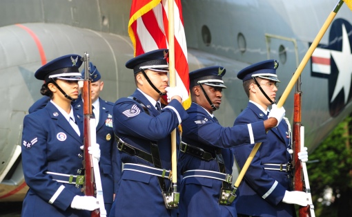
- (Photo by Air Force Staff Sgt. Matthew Fournier) – CC/BY

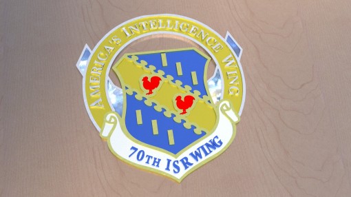
The 70 ISRW is Headquartered at Fort Meade, MD with over 4,000 Airmen serving at several Groups, Squadrons and smaller Operating Locations around the world. The 70 ISRW employs about 50 career fields performing hundreds of different missions, from language analysts to HVAC specialists. As the premier Cryptologic Wing in the USAF, the 70th’s primary mission is to deliver accurate and timely intelligence products to national, NATO and allied leaders for strategic and tactical awareness of our adversary’s intentions and activities.
I started the process by free sketching all ideas that came to me. In this stage I felt it important to not discount any idea and sketch it out anyway, even if I knew it was a bad design from the start. Sometimes putting a half-baked idea down on paper will spur the imagination or thought process to create something better.
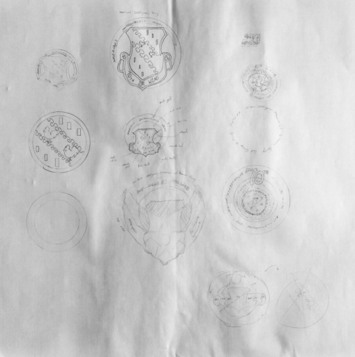
- My initial sketches. Click for full size.

The best or most effective ideas from the initial sketches were combined or refined.

Once I selected a design to develop further, I went into GIMP to line out the shape and features. At this particular time I wasn’t as familiar with Inkscape yet, so what could have been easier done in Inkscape was done in GIMP.

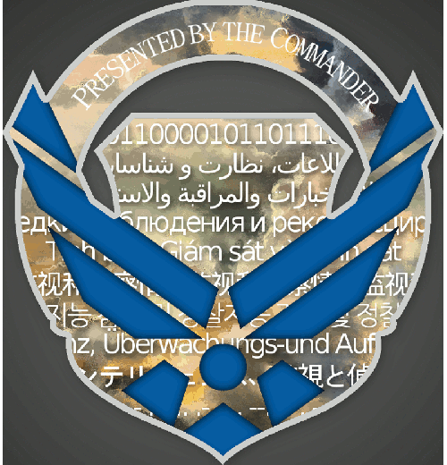
The coin’s back was filled in with text, shadows and a cloud texture backdrop created by merging a wonderful cloud painting by riantrost and a cloud photograph by Quincula for color and subtle texture variances. The text reads “Intelligence, Surveillance and Reconnaissance in morse code (pre-WW2), German and Japanese (WW2), Korean (US-Korean Conflict), Vietnamese (US-Vietnamese Conflict), Russian (Cold War), Arabic (Gulf War), Pashto/Urdu (I ended up using Persian-Farsi in a pinch) (Afghan War), and binary (emerging Cyber battlespace) to represent the different conflicts that the Air Force (and Signal/Air Corps before that) has been involved in since it’s inception.

- First draft of the back design. Created in GIMP.

To simulate a rough metal finish on the coin’s front, I selected the surfaces I wanted the texture applied to and then used the HSV noise filter on a transparent layer. By selecting the surfaces first, the noise was only applied to those areas, leaving the areas I intended to be smooth noise free. I could have also applied the noise filter to the entire layer and used masks to block out the noise free areas.

- Noise texture to give a rough finish for certain parts.
To simulate the smooth metal of the edges, I used a layer with a gradient that had a mask of the design’s edges. I left the blend mode as normal but did lower the opacity to half.

- First draft of the front design. Created in GIMP.

After discovering Inkscape’s “Trace Bitmap” feature that I wrote about recently, I was able to generate and modify .svg versions of the Air Force logo, 70 ISRW shield and various other portions. In order to bring the a shape into Blender that I could build further on, I used various basic shapes and whatnots in Inkscape and set them up to import into Blender.
I’m not sure if there is a way to combat this during the import process, but my .svg shapes were always tiny–sometimes I had to scale them by 1,000%. If you import an .svg and can’t see anything, check your Outliner and see if a “curve” shape is there that wasn’t there before. By clicking on it and then hitting the Delete or “.” key on your numpad while your mouse is over the 3D window will zoom your view to center over the imported .svg parts.

- Finally started using Inkscape–which I should have from the start.


- The an early .svg used to import into Blender. With each successive try it got better.


- How to activate the .svg import script in Blender.


- All the pieces that imported. Each color imported it’s own curve object and then some, so I ended up with a few duplicates or oddities.

The .svg will not import as one curve, but many curves depending on your source .svg file. For example, importing the world “Hello” will create five curves (one for each individual shape) rather than just one curve of five letters. But, we should get back to the coin…
This outline along with the extracted shapes were brought into Blender for building, extruding, texturing, and lighting. I used Cycles for materials and rendering. Since the individual objects were solid colors, I didn’t worry about unwrapping or generating texture coordinates. (Although for the clouds I did use a texture mapping node and “pushed” the texture to where I needed it by fiddling with the XYZ/UVW position and scale values.)

- A fly-apart view of the different elements.

- The first render. It looks bad now, but I was happy with it considering I didn’t have to model it by hand.
The Back was done in GIMP and the front in Blender. I was (am!) still weak on my modeling skills and time was running short, so I stuck with a 2D back. I figured as long as I can give them a nice 3D front, they could mentally pull those ideas and visuals to imagine the back.
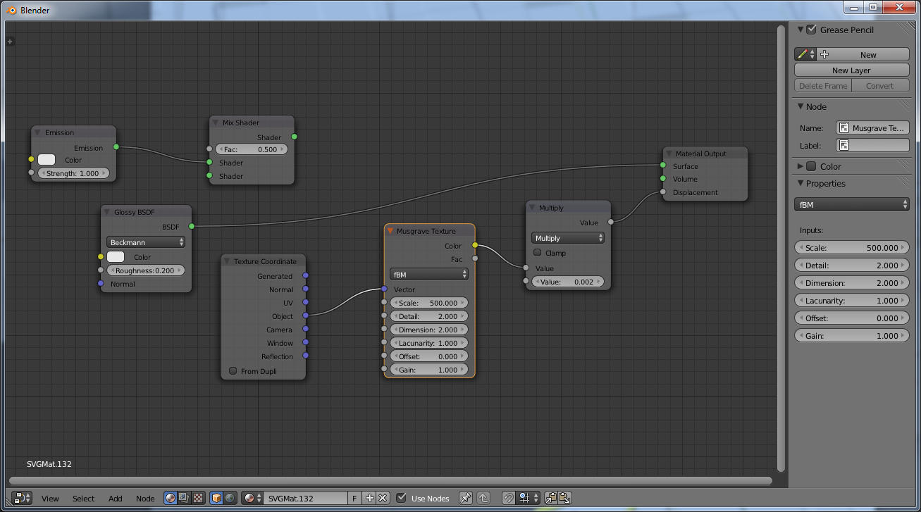
Rough surface texture node setup. Click for larger image.
The rough texture was created by using a musgrave texture as the material’s displacement. I used a math node to control the intensity of the displacement/bump. There might be better ways to control the intensity, but this is a method I’ve found that works well for my workflow.
I built a nice proposal to really sell the idea. I firmly believe that presentation is more important than content, so I tried to make my presentation as nice as possible. I included a Freestyle render in blue to give the design a more blueprint feel as a way to gain credibility as a designer by stealing the confidence you subconsciously have for an architect or engineer when they roll out a blueprint on your desk.


The settings for Freestyle were actually fairly default. I just changed the color and set the thickness down a little bit. In GIMP I blurred it slightly and then added a non-blurred version above it to make it look more like it was printed on paper.
Not long after submitting my idea…

The formal submission of the coin design. Commander’s notes can slightly be seen in one of the upper corners.
…I was notified that I was selected ahead of 10 other submissions <yay!>. I met with the Commander who gave me his feedback.
He liked the presentation and the idea, but he was weary of the clouds and also thought that the translations appealed to only the linguists in the Wing.
Based on that feedback I modified the original version. We met to critique the design after each revision. The Commander wanted a way to capture the whole Wing, rather than just the linguist or analyst folks. To accomplish that I decided to use the Occupational Badges (unique symbols for each career field that we wear on our uniforms, much like the original Star Trek badges) for each of the career fields featured in the Wing. I tried different layouts, but there was no good way to capture them all and have it show clearly on the final coin. I even went back to languages hoping that might help. When that idea failed I tried using the emblems of the various Groups under the Wing. I also tried listing out the AFSC codes (Air Force Specialty Codes–letters and digits that designate an Airman’s job, position, and skill level) one after another using different fonts to make it look like a code. The idea was that those “in the know” would know they were AFSC codes and would have the inside “intel” that non-Air Force folks wouldn’t have.
- The different ways I tried to capture the vision of representing everybody in the Wing.

You might have noticed a slight shape change in the middle there. I made a more accurate version of the coin and increased the GIMP file’s resolution from 800×842 at 100dpi to 3,000×3,000 at 300dpi.
Since our Wing has Airmen stationed in all corners of the world, I decided a globe would be the best way to show “we’re all here”. I first tried a globe outline, but settled on a dot-matrix globe instead. Making this was a source of huge frustration, trying various filters and whatnot. I applied a filter over a map in GIMP that gave it a half-tone pattern. I then brought that into Inkscape and did a “trace bitmap” function to create the .svg version. You can see in the below image that I masked the area where a key and text would be placed (more on that in a second).

- Globe dots created using the half-tone pattern in GIMP and then brought into Inkscape. The key and words were masked before converting to an .svg file, that’s why Europe, South America, and middle Africa have chunks missing.


Filters > Distort > Newsprint works great for creating halftone patterns. Increase the oversample for cleaner circles.
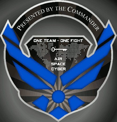
Another change you likely noticed was that the sky texture was abandoned. Folks who saw the design were getting confused with the clouds or thought it looked too busy. I tried a render using the clouds as a bump map and having it as a relief, but that didn’t look good at all so I scrapped the clouds and went with rays, which was something the Commander indicated he would prefer to have. By abandoning the clouds texture, we had a cleaner look and saved $100 on image screening fees.

- Rays replaced clouds for a cleaner look and cheaper cost.

The Commander wanted to show that the Wing has missions in the Air Force’s battle domains and asked that we add “Air – Space – Cyber” to the coin. Along with those three words, he wanted a key icon to be incorporated around those words somehow. “The key represents the AF ISR Agency’s effort to unlock its protagonist’s secrets. The teeth on the ward symbolize the disciplines of intelligence gathering – SIGINT, HUMINT, IMAGERY, and MASINT” (AIA/HO, 2000). [SIGINT is Signals Intelligence, HUMINT is Human Intelligence, and MASINT is Measurement and Signature Intelligence (bleeps, blips, fumes, and rays).]
- Trying different ways to make it look nice. I also tried versions with the dashes between the words being the keys, but that didn’t translate to well.

We finally landed on a final design that we were comfortable with. I cleaned up the meshes, made a back version in 3D, improved the lighting and materials, and made a cleaner render.

- The final beauty shot! (Click for larger size.)


All the Blender bits that made up the two halves in the beauty shot. The black ‘floor’ was actually an ANT terrain mesh with a gloss+musgrave material.
I gathered the .svg files, high-resolution front orthographic renders of the front and back, and color swatches and submitted them to the coin company to have them minted.
What I was surprised with once we got the proofs back was that it seemed like they did not use the .svg files I had sent them. There were alignment issues, especially on the ISR portion with the ‘R’ being too low. We asked them to correct this, but when the final coins came back the ‘R’ was still dropped too low. This is the second coin I’ve designed, and both times the coin company did not use the source .svg files, so if you work in this industry and are reading this article–please let me know why this is? Even if you don’t use that .svg to do the actual designing, why weren’t the .svg files used as a springboard during the in-house design stage? In this instance, it was a few minor things were off, but in the 22 IS coin there were significant differences.

Size comparison using a EU coin, I’m guessing a Russian coin, and a U.S. “George Washington” dollar coin (he’s on the other side).

- Close up of the ISR. Note how the ‘R’ is dropped lower–it should be even with the ‘S’. Also note the bubbles in the paint.


- The gold paint on the edges is rather fragile. The image makes it look like welding marks the way it rubs off.

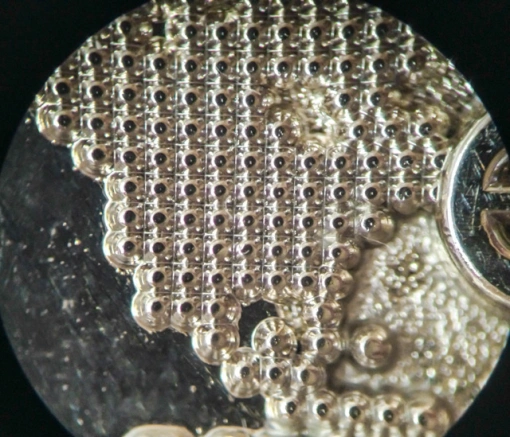
- Close up of the dots that make up the globe.

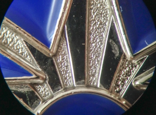
- Here you can see how the alternating bands of the rays were created.


- Close up of the word ‘Cyber’. The scratches were the result of rubbing two coins against each other as I was trying to set the photo shoots up.


Several days after being shown the final coin design by the Commander, I was presented with this awesome plaque with the two faces of the coin and an engraving. I was very touched that the Commander and his Executive staff thought enough of the new coin to present me with this gift. It brings me great joy knowing this coin will be presented by the Commander to a few of the Wing’s Airmen for doing great work.
GIMP 2.8 supports layer folders–If you do any work in GIMP, I highly recommend maximizing use of this layer management method. Not only does it keep your layers organized in a hierarchical manner, but it also keeps overlay effects influence contained within that folder’s other layers. In total there were 48 layers–everything from shadows to text.

For more on working with Inkscape, please check out my Inkscape to Blender article or some of the several good Inkscape “trace bitmap” videos on YouTube or Vimeo. {Please note: as of this writing the images in the Inkscape to Blender article are missing–I’m working on restoring them.}
Even though Blender was not used to initially create the back, having the 3D mockup provided us an opportunity to visualize what the coin would look in physical form. It also allowed me to generate additional files for the coin manufacture’s CAD system. I really think having the front in 3D helped “sell” the coin design as well, even though the render itself wasn’t all that great.
I would like to leave you with a sequence of each of the variations in order. Thank you for taking the time to read this article, and please feel free to leave a comment if you have any questions or comments about this design process.

And if you would like full-size renders of the coins or Wing emblem:
Link to Wing Emblem wallpaper.
Link to Coin’s Beauty Shot wallpaper.
Thank you for reading! -BnBGobo99


